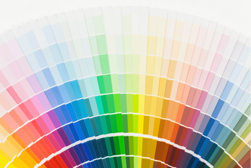
Color is arguably the strongest branding tool. It can drive perceptions, mood, and even buying habits. For marketers and brand strategists, color psychology is essential while creating a visual identity that will resonate with the target market. In this in-depth guide, we will see how colour psychology works, what each colour implies, and how successful brands use color to leave lasting impressions.
1. The Science of Color Psychology
Color psychology is the study of how colors affect human behavior and perception. It combines neuroscience, cultural context, and personal experience. Applied to branding, the right color elicits specific emotions and behaviors in potential customers.
Why It Matters:
First Impressions: Consumers have been found to form an automatic opinion about a product in 90 seconds, and they use color to form up to 90% of this opinion.
Brand Recall: Color boosts brand recall by up to 80%.
Emotional Influence Emotions such as trust, excitement, or calmness can be evoked by Colors, which directly influence buying behavior.
2. The Significance of Popular Brand Colors
Let’s break down the most common colors used in branding and what they typically represent:
Red: Energy, Passion, and Urgency
Red is a strong color. It is used to communicate excitement, energy, and passion. It is often used in companies that want to create a sense of urgency or stimulate hunger.
Common Brands: KFC, YouTube, Netflix, Coca-Cola
Best suited for: retail, leisure, and food industries
Blue: Trust, Stability, and Professionalism
Blue is the favorite corporate and technology brand color because it is linked with reliability, intelligence, and serenity.
Global Brands: Facebook, Intel, IBM, PayPal
Suitable for: Finance, healthcare, and technology sectors
Yellow: Optimism, Happiness, and Clarity
Yellow is bright and attention-grabbing. It is a happy and optimistic mood.
Popular brands: IKEA, Snapchat, McDonald’s
Best for: Food, kids’ stuff, and travel
Green: Growth, Health, and Tranquility
Green is associated with nature, growth, and wellness. This best fits green and wellness brands.
Brands: Whole Foods, Starbucks, Animal Planet
Ideal for: Health, organic, and green brands
Orange: Enthusiasm, Creativity, and Confidence
Orange is the blending of red’s energy and yellow’s happiness. It’s typically employed to represent playfulness and creativity.
Brand Recognition: Fanta, Nickelodeon, SoundCloud
Best suited for: Shopping, startups, and entertainment
Purple: Luxury, Wisdom, and Spirituality
Purple historically has been the color of refinement and royalty. Purple connotes fantasy, mystery, and luxury.
Popular Brands: Hallmark, Yahoo, Cadbury
Best for: Beauty, luxury brands, and education
Black: Power, Elegance, and Sophistication
Black implies sophistication, power, and contemporariness. It’s a luxury fashion and branding darling.
Iconic Brands:Chanel, Nike, Apple
Suitable for: Fashion, technology, and luxury products
White: Simplicity, Cleanliness, and Purity
White symbolizes purity, simplicity, and openness. It is used mostly to create minimalist and modern designs.
Top Brands:Apple, Adidas, Tesla (used as a base color)
Best for: Technology, spa, and luxury
Pink: Compassion, Femininity, and Playfulness
The most traditional association of pink is with softness, romance, and motherly energy. It is used most frequently in branding for women.
Brand Popularity: Barbie, Victoria’s Secret, Baskin Robbins
Suits: Fashion, beauty, and children brands
3. Cultural and Contextual Considerations
Symbolism by color can differ dramatically between cultures. Global brands must learn to appreciate how colors are viewed in each region.
Red: It signifies passion in Western cultures and good luck and prosperity in Chinese culture.
White: It is equated with innocence in the West; it is associated with mourning in some Eastern cultures.
Green: Positive in the majority of cultures, but in Western cultures, it implies jealousy.
4. Combining Colors: The Art of Color Harmony
Not many brands consist of a single color but numerous colors. Color harmony is critical in the construction of visual appeal and brand coherence.
Monochromatic: Depends upon differences in saturation and lightness of a single color.
– Analogous: Comprises colors that are next to each other on the color wheel.
– Complementary: Applies colors that are opposite one another on the color wheel.
– Triadic: Uses three equally spaced colors from the wheel.
Choosing a proper color scheme helps create contrast, capture attention, and build brand identity.
5. Case Studies: How Top Brands Use Color
Coca-Cola (Red)
Coca-Cola uses red to evoke excitement, boldness, and appetite. It’s a strategic choice that has helped the brand remain iconic for over a century.
Apple (White/Black/Gray)
Apple’s monochromatic color scheme symbolizes simplicity, sophistication, and innovation. The minimal visual identity symbolizes the brand’s futuristic design ethos.
Starbucks (Green)
Starbucks’ green logo symbolizes its commitment to sustainability, peace, and health-oriented living.
6. How to Select the Best Brand Colors
1. Know Your Brand Personality: Are you professional, fun, luxurious, or green?
2. Know Your Target Audience: What colors will resonate with their emotions and values?
3. Gather Competitor Intelligence: Find out what is working in your space, and how to stand out.
4. Test Your Palette: Apply the method of A/B testing or surveys to know what your public sees.
5. Be Consistent: Once selected, apply your colors consistently across all brand touchpoints.
Conclusion-
Color isn’t something you decide on as a design choice—it’s a part of your brand identity. By being aware of the psychology of color and how it impacts your consumers’ perception, you can establish a brand that doesn’t just appear good but feels good as well to your consumers. Whether you’re launching a new brand or rebranding an existing one, take the time to choose colors that represent your purpose, resonate with your target market, and make you stand out in a crowded online space. We specialize in developing brand identities that leave a lasting impression. Get in touch with us for a unique color strategy that reveals your brand’s truth.